

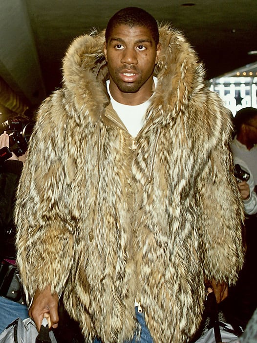
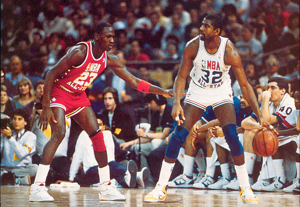
More than any other league, the stars of the NBA have style. From Clyde’s hats, to Magic’s fur, to Russ’…uh…whatever this is, the NBA has a rich history of setting fashion trends. All-Star weekend is the league’s biggest party and the best chance for an NBA player to show off his sartorial flair to the world. The short-lived All Star, All Style fashion show never caught on, but the All-Star sidelines always seem to end up looking like a Bryant Park catwalk, anyways.
There’s fashion ON the court, too, where the game typically features a colorful set of avante garde jerseys and sneakers. This year, though, the Jordan Brand opted for some really understated uniforms — nothing but black and white. Kinda makes you wonder if every other more-interesting possibility had already been exhausted.
At least, it made ME wonder that; so, I looked up every All-Star Game jersey of the past 40 years and here’s what I found:

Sort the jerseys by year and you’ll see how the color schemes shift around every five years or so. Below, I examined each uniform period and tried to lay out an anthropology of fashion that could explain how we ended up with the black and white jerseys of 2018.

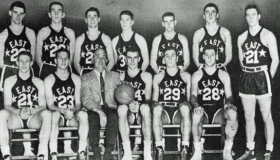
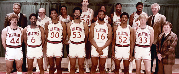
The NBA’s first All-Star Game was held in 1951 in the old Boston Garden and it featured some pretty tame uniforms – just six small stars on a solid, neutral-colored background. Of course, all of the photography was black and white back then, so I suppose it would have been pretty useless to make the outfits more colorful. A few years later, the league spiced things up by adding “East” and “West” to the front of the ensembles. Très chic!
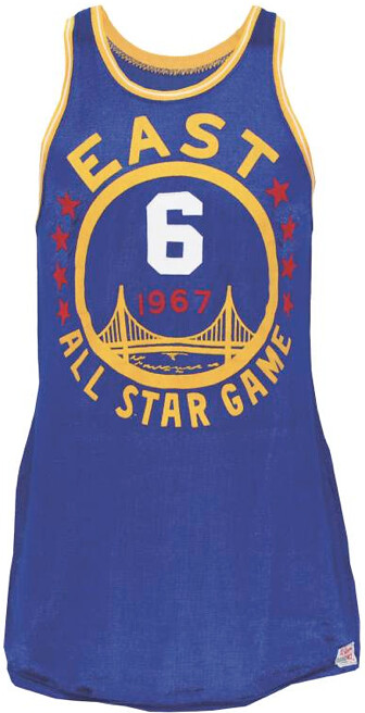
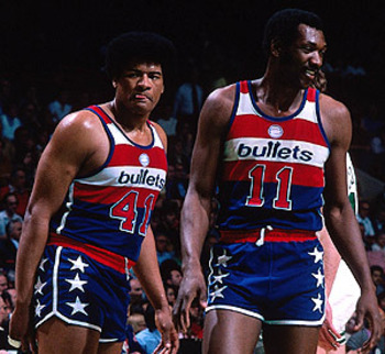
The NBA changed tack with the All-Star fashions for the 1967 game in the Cow Palace of San Francisco, adopting a home-team inspired look. This tradition continued thru the end of the 1970s with each jersey designed to echo the home team’s look. So, for example, the 1977 game in Milwaukee featured the Bucks signature Good Land Green-colored shirts and an incredible beer stein patch on the shorts. Likewise, the 1980 game in Washington showcased a cool adaptation of the already-pretty-cool Bullets uniforms from that season.
Mixed in at the end of this locally-themed jersey period, were two funky designs infused by the freewheeling spirit of the recently acquired ABA — a crossword-like logo in 1978 and a set of mismatched diagonal uniforms in 1979. These experiments paved the way for the next era of All-Star jerseys: the red, white, and blue period of the 1980s.

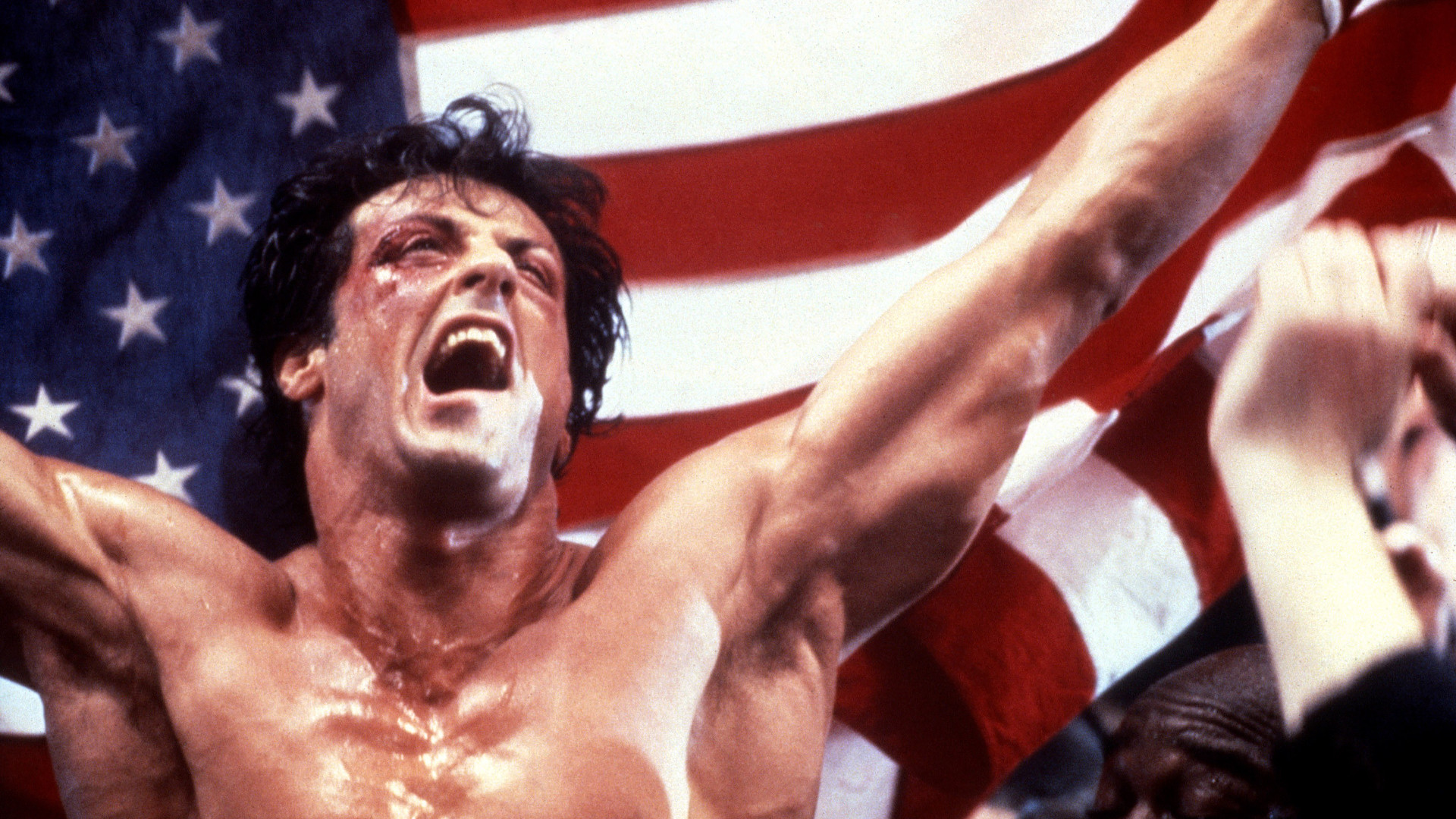
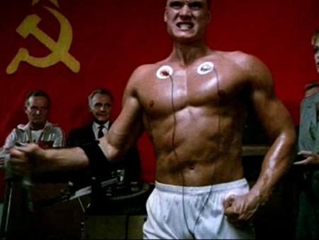
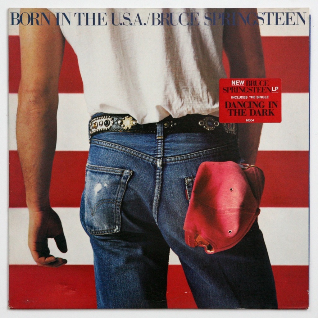
In his 1989 Farewell Address, President Ronald Reagan celebrated the “resurgence of national pride” that marked his two terms in office. The Gipper’s so-called “New Patriotism” began as a flag-waving reaction to the harrowing 444-day Iran hostage crisis at the beginning of the decade. A subsequent exchange of Olympic boycotts in 1980 (Moscow) and 1984 (L.A.) stoked the patriotic flames further.
Naturally, the red-white-and-blue spirit seeped into the pop culture of the time. There was Rocky, draped in Old Glory after knocking out the Russian ideal incarnate, Ivan Drago (Rocky IV, 1985). There was Mav parked in front of the Stars and Bars, after flipping the bird to a Russian Mig-28 jet pilot (Top Gun, 1986). And there was The Boss, donning red, white, and blue and posing in front of an oversized flag for the cover of his fist-pumping patriotic anthem, “Born in the U.S.A.” (1984).
It was amidst this cultural context that the NBA turned to the red, white, and blue color palette. The quintessential All-Star Game uniforms debuted in 1986. They were SO good that the league just ended up using the same design for the next four seasons. They even decided to run them back for one last appearance in 2003.
Those beauties were years in the making. From 1981 to 1985, there were less successful prototypes that tinkered with different colors, stars, and text placement, before the perfect combination was identified.

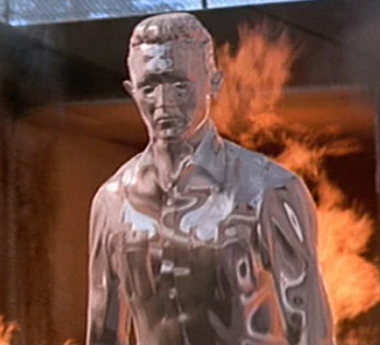
In the early 1990s, the old Cold War boogie man was replaced with a new threat: the T-1000, a shape-shifting android from the future created out of a mimetic polyalloy, a liquid metal assassin (Terminator 2, 1991).
The metallic trend seized control of the fashion scene faster than a Skynet takeover. Whether it was En Vogue, TLC, Spice Girls, Puffy, or Ma$e – shiny metallic clothing was the bomb in the ‘90s. So, it made perfect sense when the NBA amped up their red, white, and blue classics with a little bit of futuristic metal sheen.

The two Fiesta designs were so wonderfully kooky.
After 15 years of various combinations of red, white, and blue, the league made a huge departure from the traditional color scheme and returned to the concept of having jerseys inspired by the host city.
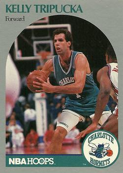
The outlandish color choices of ‘95 and ‘96 have their origins in Charlotte, North Carolina. There, in 1988, the Hornets hired fashion designer, Alexander Julian, to create a look for the new team. Julian opted for his signature purple and teal styling and — about a billion Starter jackets later — these colors became the only viable option for an aspiring sports team. [Quick aside: Apparently, Julian wanted the shorts to be long and baggy, but Kelly Tripucka and his teammates had them retailored behind his back to show off their white spandex bike shorts]
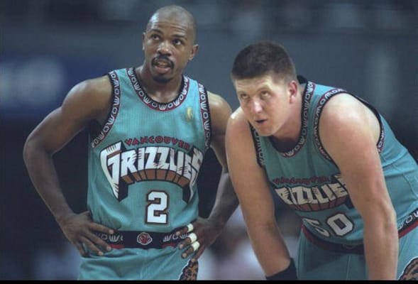
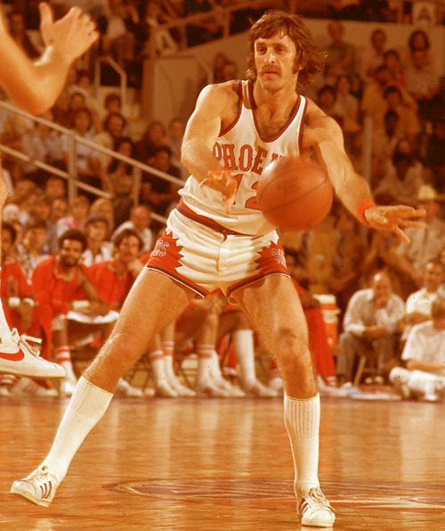
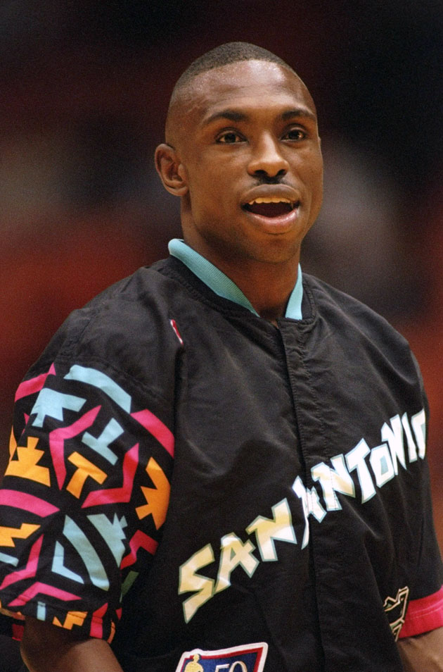
Really though, think about it for a second…during the 1990s, pretty much every new or rebranded franchise in American sports had purple or teal jerseys. The Raptors and Grizzlies in the NBA; the Marlins, Rockies, D-Backs, and Devil Rays in baseball; the Jaguars and Ravens in football; the Sharks, Ducks, and Coyotes in hockey. Even some well-established NBA franchises decided to toss some random teal and purple into the mix. The Phoenix Suns had been wearing purple since the ‘70s, but they really doubled down in the ‘90s. Likewise the normally-stoic San Antonio Spurs embraced the trend, too, adding a pop of color to their traditional black and silver scheme.
So, in 1995, when the All-Star festivities were held in Phoenix, we got some flashy purple and orange numbers with a cactus theme. The following year, the game was in San Antonio, so the uniforms were teal, pink, and orange with a chilli pepper flourish. These were the colors of the real Southwest, and mauve wasn’t one of them.
Personally, I love these wacky oddities, but I’m pretty sure the NBA office did NOT.

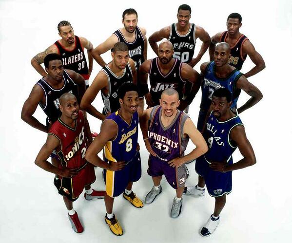
At the next five All-Star Games, the league opted to forgo jersey design altogether. The players were asked to bring in their uniforms from home, instead.
In addition to dealing with a Fiesta hangover, the NBA was perhaps also trying to emulate the success the MLB All-Star Game. Baseball’s home-run derby was the premier All-Star event at the time, with the 1996 competition featuring a down-to-the-last-out slugfest between Mark McGwire and Barry Bonds. The MLB stars, of course, wear their own unis to the ASG.

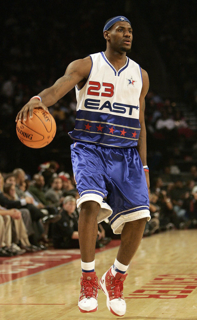
Following the World Trade Center attacks in 2001, there was another surge in American patriotism which crested in 2003. Once again, the national mood coincided with the All-Star jersey design, as the NBA returned to red, white, and blue. The league sought comfort in the familiar design of the late-’80s for one year. Then, from 2004 to 2009, they experimented with some modern updates on the patriotic theme.
The 2003 game also coincided with the league’s renewed emphasis on globalization. Yao Ming and Manu Ginobili were rookies and the following year saw the NBA China Games and an Olympic gold medal for Argentina. The global market for the NBA was expanding and Commissioner David Stern was focused on hosting big events that would catch the attention of multinational corporate sponsors and the international media. All-Star weekend was the biggest bash of the season. Perhaps Stern recognized that the bring-your-own All-Star jersey approach was leaving money on the table – wasting an opportunity to market new ASG merchandise to the growing global market.
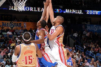
Personally, I’m fond of the 2006 models represented above. They were an ambitious mix of new elements — with the diminishing stripes, accent colors, and modern fonts. Most of the jerseys during this period were pretty uninspired, but the two-toned jerseys that debuted in New Orleans in 2008 were downright ugly.

The modern red, white, and blue era slowly morphed into a red-vs.-blue era from 2010 to 2013. These jerseys all looked very similar to each other and they’re not especially memorable. One exception is the ombré look (shown above) with the shooting star detail — those were pretty tight.

The 2014 All-Star Game was Adam Silver’s first as league commissioner after 30 years with David Stern at the helm. Silver emphasized the newness of his regime with a bold All-Star jersey redesign. Nominally, the 2014 uniforms were still red and blue, but they were certainly not the traditional hues. Plus there were those green and purple accent colors reminiscent of the Fiesta period. Not to mention the huge fleur de lis logos on the chest. And the sleeves. You can’t forget about the sleeves. Yikes.
Next: Paul Pierce was never cool, man
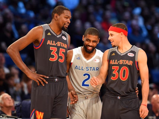
There’s plenty to dislike about the 2014 look, really; but it certainly was UNIQUE. Those jerseys signaled that Silver was open to experiment and that he wouldn’t be afraid to buck tradition; they opened the door to more unconventional design choices in the years that followed. In 2015, there was that blank starkness on the front of the jerseys combined with the first- and last-names of players on the back. Last year, there was an ambitious mix of black/red/gray for the West and gray/blue/white for the East — the designs were complicated, but ultimately pretty successful. Or, at least, they could have been successful, if not for Steph Curry’s headband.

This season, Nike is taking over for Adidas in the design department. Thanks to the series of innovative jerseys created in the past few years, Nike’s Jordan Brand had seemingly every possible color at their disposal in 2018, but they are opting instead to go monochromatic . According to a report from Sports Illustrated’s Ben Golliver, the Jordan Brand created black and white jerseys, because:
“They fit with the company’s general color themes, because…the classic colors will have greater and longer-lasting off-court appeal for fans, and because they won’t distract from vibrant All-Star sneaker colorways.”
The team logo offers an alternative to the traditional “East” and “West” team names, which won’t apply this year due to the All-Star draft. It will be interesting to see if the white and black color scheme is a one-off or if it will become the next All-Star Game fad.