
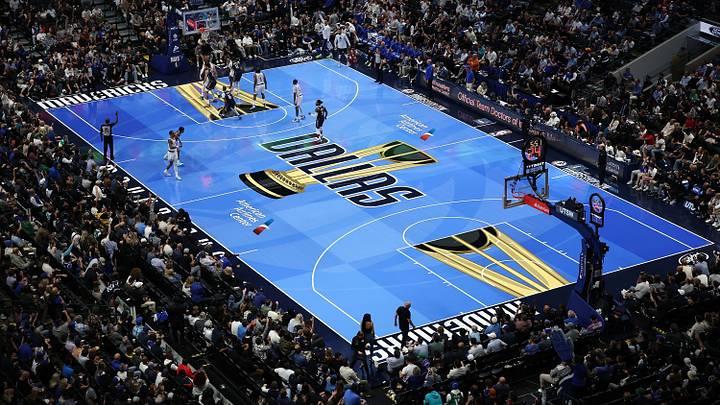
The NBA Cup has more or less earned its place in the national conversation. Most fans are learning to care, even if it feels like a distant second to competing for an "actual" championship. This season's final will be played at historic Hinkle Fieldhouse in Indianapolis, which serves as a nod to the great tradition of this sport. It will feel a whole lot more special than playing in Las Vegas.
If there is any controversy around the NBA Cup at this point, it starts with the court designs, which have ranged from noisy to outright unwatchable in years past. The NBA has simplified its design package for all 30 teams this season, but there is naturally a great divide between the best- and worst-looking courts. Let's rank them all.
30. Los Angeles Lakers
The Lakers’ floor for the NBA Cup this year: pic.twitter.com/lg8kBe1Qqv
— Trevor Lane (@TrevorLane) October 13, 2026
Honestly, this court is fine enough in a vacuum. But like the actual Lakers uniforms, the yellow is a shade too bright. The Lakers also keep trying to work black into their color scheme and it fundamentally does not work. The stars and stripes along the sideline is a nice flourish, but you can hardly make out the purple. Maybe it will look better on a TV screen.
29. Boston Celtics
Boston Celtics new NBA Cup court design has been revealed pic.twitter.com/5bWjHtQqho
— Ian Inangelo (@iinangelo) October 13, 2026
As a strong proponent of artistic innovation, the inclusion of basketball's two most historic franchises at the bottom of this list probably warrants a bit of self-interrogation. Am I really just a sucker for tradition, at the end of the day? The Celtics' parquet floor is iconic; rendered in bland slate grey on the sidelines, it borders on sacrilege. Also, what's with the black logo? The Celtics also, famously, do not have black in their color scheme.
28. Golden State Warriors
What do you think about the Warriors’ NBA Cup court design for this season?
— SleeperWarriors (@SleeperWarriors) October 13, 2026
We’ll first see it on Oct. 30 against the Lakers 👀 pic.twitter.com/JdwjtliuAf
These are grim times for innovation in Silicon Valley, so fittingly, the Warriors' NBA Cup court has zero artistic spark or visual separator. There are several grey NBA Cup courts; Golden State is doing the absolute least with it. That is just the normal baseline with a grey court and some Canva-a** font superimposed in the middle (every court has the Canva-a** font, to be fair).
27. Washington Wizards
The Washington Wizards’ court for the 2026 NBA Cup: pic.twitter.com/griHf3hwmw
— Greg Finberg (@GregFinberg) October 13, 2026
Historically, the red NBA Cup courts are an eye sore in practice. It's just too much red (with a slightly off-shade basketball being dribbled up and down) on your poorly calibrated TV screen. The overall color scheme works in a vacuum, but there's nothing special or distinctive about this court. Your team is called the Wizards, please act like it.
26. Chicago Bulls
First look at the Chicago Bulls’ 2026 Emirates NBA Cup court. 👀
— BullsMuse (@BullsMuse_) October 13, 2026
Thoughts on the design? 🏆 pic.twitter.com/EmeZDhiJhF
Another red court with a grey trim, how fun. The Bulls are another team with so much history, so much iconography, baked into their image. It can make these viral NBA Cup designs a bit hard to stomach. Alas, Chicago's font is better than Washington's font. That really is the only difference.
25. San Antonio Spurs
Here is the Spurs’ NBA Cup court, which replaces a big Texas logo with the team name. The league has shifted to this style for every team this year, ditching the individualized backgrounds for the teams last year. pic.twitter.com/pftPHqkYxI
— Jared Weiss (@JaredWeissNBA) October 13, 2026
I will amend these rankings if the Spurs wear glow-in-the-dark jerseys. I am optimistically assuming the Spurs will only wear their white uniforms on this court, which could provide a nice contrast, but it's hard to do anything exciting with San Antonio's color scheme. We can be honest.
24. Oklahoma City Thunder
First look at our NBA Cup court 🔥
— OKC THUNDER (@okcthunder) October 13, 2026
Set to debut in OKC on November 20 🗓️ pic.twitter.com/OZ2Fu6Ys18
If there's anything worse than a red court, it's an orange court. At least we were spared that. What this design practically begs for, however, is an orange baseline, which could help the otherwise plain navy pop.
23. Charlotte Hornets
Charlotte Hornets court for the 2026 NBA Cup: pic.twitter.com/8G9vTMCnPV
— r/CharlotteHornets (@HornetsReddit) October 13, 2026
Charlotte can pull off a loud color scheme better than most teams, but "The Hive is Alive" — look, I'm sorry — is incredibly uninspired. Nothing against the color grey, but it has really become a scourge on 'alternate' sports team designs. For a team with so much visual flare baked into its D.N.A., this court is oddly flat. Next up: my thoughts on modern architecture.
22. Orlando Magic
A look at the new #Magic court for the 2026-27 NBA Cup: pic.twitter.com/RfSlQTOr8Q
— Jason Beede (@therealBeede) October 13, 2026
For my next magic trick: POOF, grey! More grey! Everything is grey! The world is ending and the lasting image of destruction imposed upon your retinas is........ GREY!
21. Brooklyn Nets
The Brooklyn Nets court for NBA CUP 2026 includes:
— Pete From @NetsFansYouKnow (@NetsFansYouKnow) October 13, 2026
🏆 The usual trophy assets.
⚪️ Following this year's theme: team's name or city have been added on the court in a uniform font.
⚫️Statement Edition Jersey font & assets have been placed by the baseline & endline. https://t.co/1Ga8Z0QKgK pic.twitter.com/IKU8iXnlls
At least the Nets own their blandness and wear it proudly. This is the Team of Grey, and for that, they have our respect. If you are not the Team of Grey, find a new slant. (Brooklyn should be using its ABA designs for the NBA Cup, but I guess it's not the ABA Cup, is it?)
20. LA Clippers
The LA Clippers’ Emirates NBA Cup court for this season. pic.twitter.com/UzpaLGUiQ4
— Justin Russo (@FlyByKnite) October 13, 2026
The Clippers lost the Paul George trade a dozen times over, but at least L.A. managed to outshine OKC with the same broad strokes of color on their NBA Cup courts. The baby blue trim does work. It does not align remotely with the Clippers' usual jersey design, but more teams should be thinking old-school or alternative with these courts. However, points are lost for "Make Waves," which is possibly the lamest slogan ever devised for an NBA team named after a boat.
19. Minnesota Timberwolves
TIMBERWOLVES NBA CUP COURT 2026/27 pic.twitter.com/krLnmnPcdt
— Wolves Lead (@TWolvesLead) October 13, 2026
Minnesota's logo is doing a lot of the heavy lifting here. The old-school Wolves redesign for this season, with that pine-green trim, really works. It helps when the on-court product is so entertaining, too. But what's that? There, in the distance? A bird? A plane? No — it's GREYYYYYYYYYYYYYYY!
18. New York Knicks
The Knicks' 2026 NBA Cup court
— SNY Knicks (@sny_knicks) October 13, 2026
(via @NBA) pic.twitter.com/4f1UwPj63w
The reigning champs are keeping it simple. Blue and orange has always worked as a color scheme and it still works here.
17. Philadelphia 76ers
The Sixers’ court for the NBA Cup tournament 🔥 pic.twitter.com/me8YwVZhsz
— PHLY Sixers (@PHLY_Sixers) October 13, 2026
Points deducted for missed opportunity. A 2001-coded black and gold design would go extremely hard. Also, the Sixers' whole deal is being red, white and blue, like the flag. Where are the stars? Where is the faux-patriotic homage? At the end of the day, this court is practical and would look much better without the ghastly trophy superimposed thrice upon it (the same note can be applied to literally every NBA Cup court).
16. Miami Heat
The 2026 NBA Cup court for the Miami Heat
— 𝙃𝙀𝘼𝙏 𝙉𝘼𝙏𝙄𝙊𝙉 (@HeatvsHaters) October 13, 2026
How we feeling? 👀🔥 pic.twitter.com/HwZMISp5sm
Much like the actual basketball team, the Heat's NBA Cup court is so bare-bones and traditionalist that it almost defies modern sensibilities. That said, this is basically a normal basketball court, slightly yellowed. Given all the complaints we can expect once these courts burn out television screens around the country, it will probably be nice to watch a couple games on a normal court.
15. Dallas Mavericks
In honor of the Mavs being back at 🏠 tomorrow:
— Sleeper Mavericks (@SleeperMaverick) October 13, 2026
What do you think of the Mavs’ NBA Cup court? pic.twitter.com/gJbcf9gS1f
Clean. Simple. Effective. The Mavericks are not doing The Most, which again, is a virtue. Dallas actually having black in their repertoire, and deploying it as their backdrop (as opposed to going blue-on-blue like half the league) really helps the central court pop.
14. Atlanta Hawks
Hawks unveil their new NBA Cup Court! pic.twitter.com/2577yhQrFC
— SleeperHawks (@SleeperHawks) October 14, 2026
This will probably read as much to aggressive and warm-toned on a TV screen, but the Hawks' throwback redesign in recent years has proven to be such a positive change. Just imagine if Atlanta was still trying to make neon happen.
13. Memphis Grizzlies
The Grizzlies court has been announced for the 2026 NBA Cup 🏆
— SleeperGrizzlies (@SleeperMemphis) October 13, 2026
What are your thoughts on the grey designs from the past few seasons? pic.twitter.com/mlBTxRIrM5
Memphis falls victim to the grey plague, but at least it's a dark enough shade to really elevate the Grizzlies logo, with its shadowed hues and piercing yellow eyes. The stylized 'MEM' down the sideline is one of the boldest accents on an NBA Cup court this season. There's an alternate universe where the Grizzlies bust out a fun, Vancouver-inspired backdrop, but for this team — with its plain-natured, grit-n-grind ethos — the current court is fine enough.
12. Phoenix Suns
The NBA today revealed the Phoenix Suns’ court for NBA Cup games in 2026.
— PHNX Suns (@PHNX_Suns) October 13, 2026
They’ll play on it at least twice:
- Oct. 30 vs. Denver
- Nov. 27 vs. Dallas pic.twitter.com/m3xAKeO0U2
I don't know, man. The orange court is a categorically terrible idea, but there's something about Phoenix's color scheme that just works for me. The logo gets a bit lost here, stacking shades of orange on different shades of orange, but this mostly feels both cohesive and eye-popping. "Suns Up" is significantly better than "Make Waves." Sorry to keep piling on the Clippers, but c'mon.
11. Houston Rockets
The new Rockets NBA Cup Court just dropped 🤩 pic.twitter.com/VDmHGvuIGd
— Houston Rockets (@HoustonRockets) October 13, 2026
Houston gets a pass for finding the most evocative shade of grey. The 'Clutch City' tagline is well presented, while the sparse hints of yellow on the baseline really tie it all together. Perhaps this court is simply too red at the end of the day, but Houston has at least found a way to make everything red without drowning its logo.
10. Toronto Raptors
The Toronto Raptors will have a new court for this season's NBA Cup games.
— TSN (@TSN_Sports) October 13, 2026
Thoughts on the first look at the design? 👀 pic.twitter.com/ROmQZXN9sy
Call me a hypocrite, but there are too many grey courts to penalize every great court. Toronto is smart enough layer silver on top of red, rather than vice versa. The maple leaf motif is also quite effective. Far too many teams passed on the opportunity to spruce up their designs with a fun visual cue on the baseline.
9. Sacramento Kings
THE KINGS NEW NBA CUP COURT pic.twitter.com/8rIhSLYTCl
— Austin (@kings_muse) October 13, 2026
THE WORLD IS ENDING AND THE VISION OF OUR DEMISE IS GREY. That said, Sacramento is at least honoring it's actual color scheme, with a 'Sacramento Proud' tagline encased in checkerboard, which I quite like. This court feels practical. It evokes the team and the city without being too loud.
8. Milwaukee Bucks
The @Bucks new court for the @emirates NBA Cup pic.twitter.com/uu1ZOVV0nT
— NBA (@NBA) October 13, 2026
Milwaukee's whole design scheme is very earthy, very forest-like, which is in keeping with their mascot. The cream-colored outline — the simple but stout 'FEAR the DEER' — all ties together nicely. The Bucks deserve a kind judgement in these trying times.
7. Utah Jazz
The new-look Utah Jazz court for NBA Cup games. pic.twitter.com/4yrQj2KOqB
— Chandler Holt (@CHoltSports) October 13, 2026
Just in general, Utah has the best design package in the NBA right now. The sky-blue mountain range on the sideline is gorgeous. The logo practically functions as a spotlight at halfcourt; the stark white-on-purple, with darker ascents all around, is a brilliant touch.
6. Portland Trail Blazers
The NBA Cup court design for the Portland Trail Blazers this season has been revealed.
— Sahal Arwo (@ArwoNBA) October 13, 2026
Portland will have this floor for games against the Spurs on 11/25 and the Thunder on 11/27.#RipCity pic.twitter.com/0EayNqHJtu
Dread it. Run from it. The color grey arrives all the same. This design is probably a touch dark and dour, but this design is also quintessentially Portland. The 'rip city runs deep' tag, with a bold red stripe down the sideline, helps to add character. Also, unlike Brooklyn or San Antonio, Portland's logo (much like Toronto's) adds a splash of warmth in the middle. There is something stormy and brooding about the Pacific Northwest that this court captures. It's hard to explain, but this is all a gut feeling at the end of the day.
5. Cleveland Cavaliers
The #Cavs Emirates NBA Cup 2026 court, which will debut on Nov. 6 as Cleveland hosts the Philadelphia 76ers in an East Group B matchup. pic.twitter.com/DMsmZgrWJ7
— Camryn Justice (@camijustice) October 13, 2026
The wine and gold works well for a tournament (and court) centered on golden trophies. The tagline of 'let em know' makes me feel absolutely nothing, especially since these Cavaliers operate antithetically to such alleged boldness and authority, but this is a very seamless and cohesive design.
4. Denver Nuggets
Thoughts on the Nuggets NBA Cup court?
— DNVR Nuggets (@DNVR_Nuggets) October 13, 2026
🩸🏆 pic.twitter.com/RDjyMieYX8
Denver could probably do something a bit more creative than the 'Mile High City' tagline with a couple pickaxes, but much like Cleveland's wine and gold, there's a coherence to the color contrast here. Moreover, the 'wine' part of Denver's color scheme is so often buried, so I appreciate the zag in making it the bedrock of their alternate court design. It feels like a true alternate design without venturing too far into left field.
3. Detroit Pistons
Here’s the Pistons’ 2026-27 NBA Cup court. Thoughts? pic.twitter.com/acWKS3hc7V
— Omari Sankofa II (@omarisankofa) October 13, 2026
From the 'In it for my city' tagline, to the blue and white stripes on the sideline, to the distinct but complementary fonts; this whole design ties together beautifully. Detroit is leaning into its natural color scheme full stop, not hedging with muted grey or navy, like half the league. From a bird's-eye perspective, at least, the Pistons struck a perfect balance.
2. Indiana Pacers
Pacers' NBA Cup court for the 2026-27 season.
— Scott Agness (@ScottAgness) October 13, 2026
- Teams wear Statement Edition uniforms for all games - so gold pinstripes for IND
- NBA Cup logo at center court emphasizes importance
- Oversized word mark at mid-court is a play off team jackets
- New tag line at both ends pic.twitter.com/IpoVcSIrk5
Take or leave 'Boom Baby!' as a bold and italicized motto, but Indiana's court should perfectly complement the vintage feel of their new uniforms. Plus, the Pacers are doing a lot with their baseline design — racing pinstripes framed by Indiana's actual border — without overcomplicating things visually.
1. New Orleans Pelicans
#Pelicans court for NBA Cup games pic.twitter.com/eP3AITN8Xz
— Rod Walker (@RodWalkerNola) October 13, 2026
The Pelicans worked an entire ecosystem into their backdrop, which is sick. It also helps that gold is central to New Orleans' color scheme, so it's as if the NBA Cup logo — thrice-featured and impossible to ignore — is a natural part of the design. If only the on-court product was this alive.
 Add us as a preferred source on Google